 Stephen Walton
Histograms for photographers can look like the kind of thing that make you want to turn off the camera straight away when starting out. Graphs? I mean graphs on the back of a camera?! Like I just want to take a photo – why do I need a maths degree now?
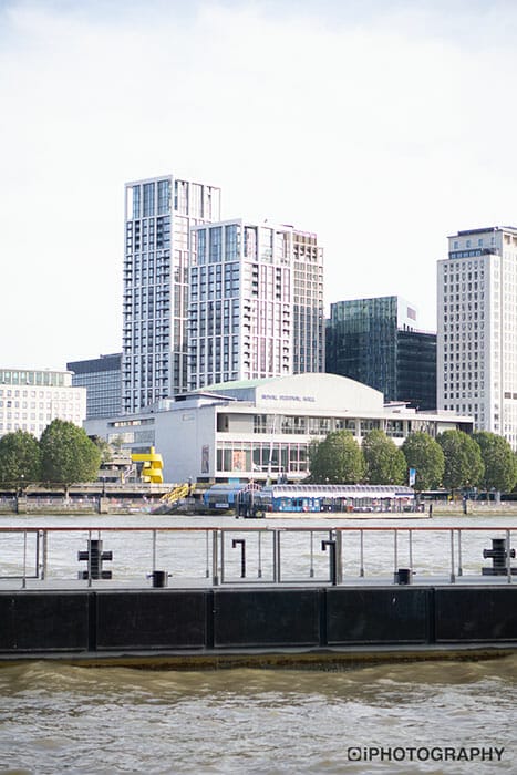
You don’t, you really don’t. Histograms are packed with information, and when used correctly, can change your photo from this…
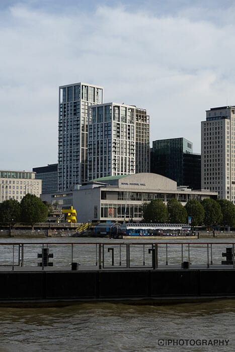
…into this…
Histograms can appear on the back of your camera or even when editing – we’d advise you to have them visible whenever you can. They are a representation of tones and brightness in the photo you are/have taken – as some cameras can give you a live reacting histogram (amazing!)
The chart denotes how many tones there are in a photo between true black (the left of the graph) and true white (to the right of the graph). The peaks in the chart shows you the volume of pixel in these tones.
All the tones in a histogram are charted from 255 (true black) down to 0 (true white). Though for beginner photography this numbering isn’t vastly important. Just as long as you know how to use a histogram in your favour.
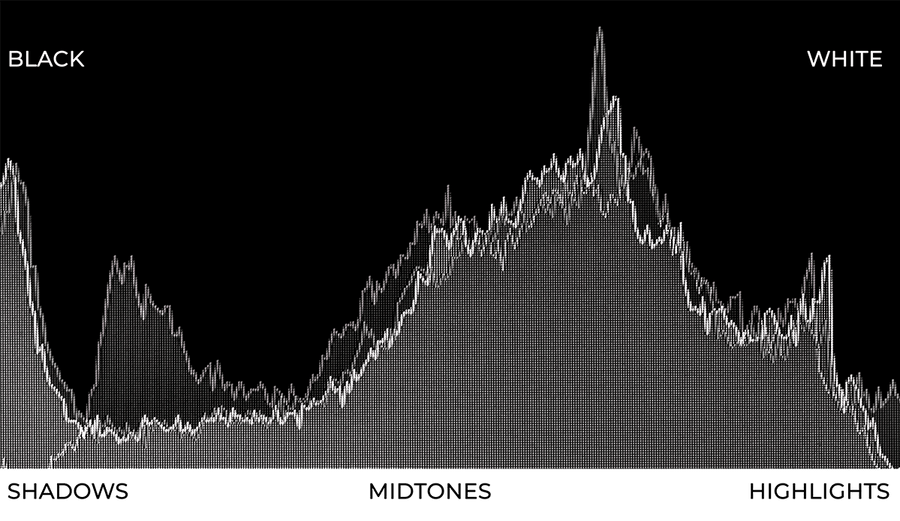
Image: How a histogram renders tone on a graph
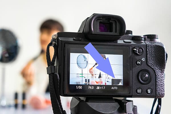
Image: Your histogram may appear like this during live view or after you’ve taken the shot.
Photographers use histograms to chart their exposure. Knowing what the graph represents we can understand how bright our photograph is looking and how many dark and colourful areas there are.
You may think this is obvious, as you can see it, based on the photo on the camera screen – but 3 inch screens lie – or at least they aren’t showing you everything, and how can it at 3 inches? Don’t fully trust your LCD screen. Instead, trust your histogram.
When you see peaks on your histogram then this says there is a lot of pixels of one tone in our photo. Depending where along the horizontal these peaks appear tells you how bring or dark these tones will be. Knowing this you can watch out for really bright areas that are over/under exposed.
As I said earlier, some cameras have a live reaction histogram to use while you’re shooting. Using this will tell you instantly whether your photo is evenly exposed or if it’s clipping. Try adjusting your aperture, ISO or shutter speed to change the exposure, and therefore the histogram. Either that or change the composition – even zooming in or out of your scene will change the exposure.
The last thing you want is to be relying on your camera’s small screen preview for all the answers. It’s really hard to appreciate and gauge the detail of your photo at 3 inches, so instead, use the histogram to create your best possible exposure.
Yes, we snuck it in during the previous section – did you see? Clipping is like an alarm we need to look out for on a histogram. When those peaks that we’ve mentioned hit the extreme left or right of our graph then that’s when our photo starts to ‘clip’.
What we mean by that is the exposure has hit or ‘clipped’ the limits of the range of colours available. Depending which end of the graph the peak is at, either this means your shot is over or under exposed in some parts.
Clipping tends to occur when your sky is so bright it just looks like a white wall of nothing. You can zoom in to the photo but you won’t see any cloud detail. Conversely, if you’re shooting at night and the histogram is peaking on the left side then it means your shot is so dark in parts that’ll just be a block of black.
Most of the time, unless it’s for a stylistic choice, you want to avoid clipping. Clipping removes flexibility when it comes to editing and also reduces the amount of detail in the final picture.
To avoid clipping make sure that your histogram never touches the extreme left or right edge of your chart. Make sure there is a little gap from the edge. In fact, some cameras have an exposure alert display/highlight clipping alert whilst you’re shooting.
Little ‘zebra’ lines appear across areas that are close to clipping in the highlights (white areas). You can set this Zebra marking to appear at different points – 75%, 80% or 90%. Check your camera manual to see if you’ve got this function.
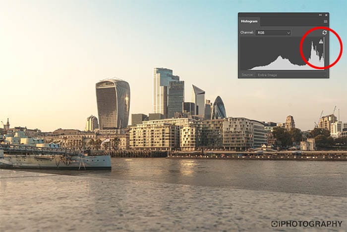
Image: If the peaks of your histogram are touch the far left or right sides then you’ll be losing detail in the highlights or shadows of the photo.
Let’s just recap on the type of histogram that we are wanting to result in with our photos. You’ll never get two histograms looking the exact same, so don’t pressure yourself to always get them looking the same. Lighting conditions vary for everyone but just as long as you’re with the correct ballpark you’ll be fine.
Remember that a ‘bad’ exposure (unless it’s for stylistic purposes) means that the histogram will be touching the far left or right of your graph. The last thing you want is peaks on each edge and a gully in the middle. This means your image is high contrast, because only the extreme tones appear and not much else in the middle.
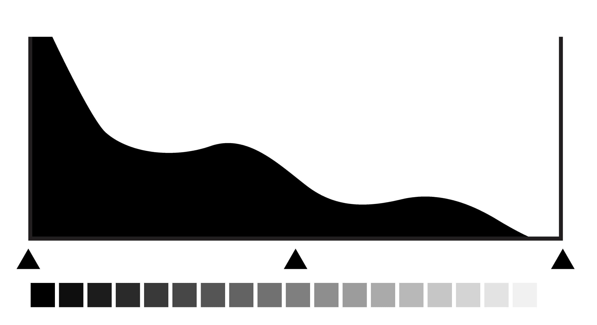
Image: This histogram suggests the image is underexposed or has lots of dark areas as it is gathered to the left of the graph. Expect night time shots to look like this.
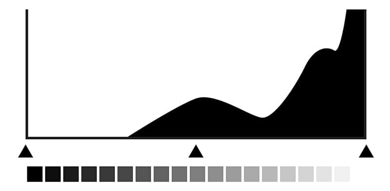
Image: This histogram suggests the image is overexposed or has lots of bright areas as it is gathered to the right of the graph. Expect pictures on a sunny day to look like this.
Ideally, you want the inverse of a ‘bad histogram’. Aim to construct a hill with your histogram. A hill that starts just off the edges of the graph and rises towards the middle. Remember though, this may not always be possible, and this ‘hill’ may look more like a rocky mountain range – which is fine too.
This ‘hill’ or ‘mountain range’ histogram means you’ll have some tones stand out more than others. Providing there aren’t too many individual gullies and peaks then you should have a decent amount of colour tone throughout your shot.
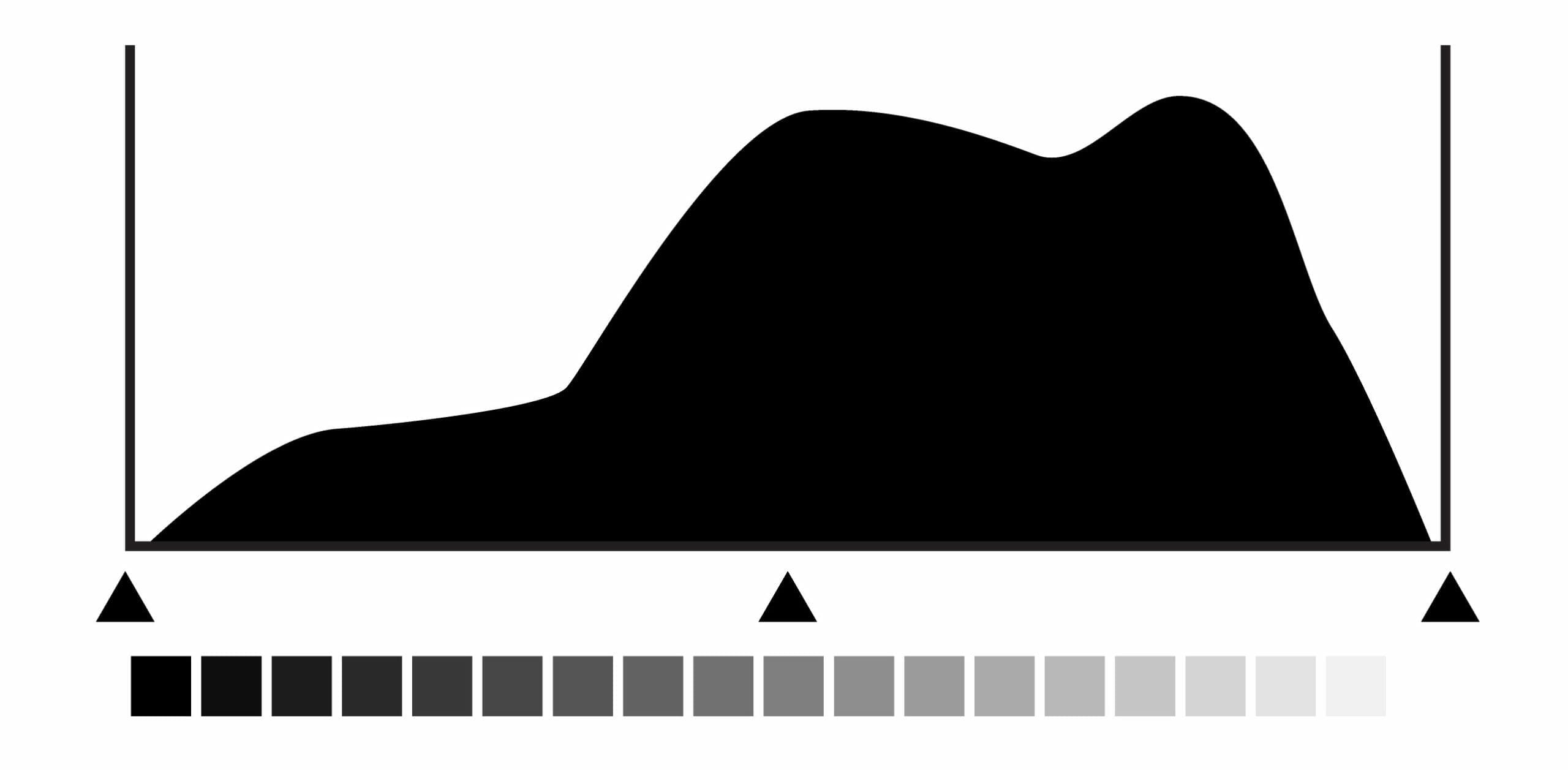
Image: The ideal situation to be in is where the histogram isn’t touching either side of the graph.
Have we managed to convince you of the power and usefulness of a histogram? Will it encourage you to use it while shooting from now on? A histogram will not only improve your knowledge of how to control your exposure, but your image will also be stronger.
You’ll not suffer from clipped highlights and shadows and you’ll be able to recover important detail in editing if needed.
We’d love to know. Get in touch and tell us your experience of using histograms.
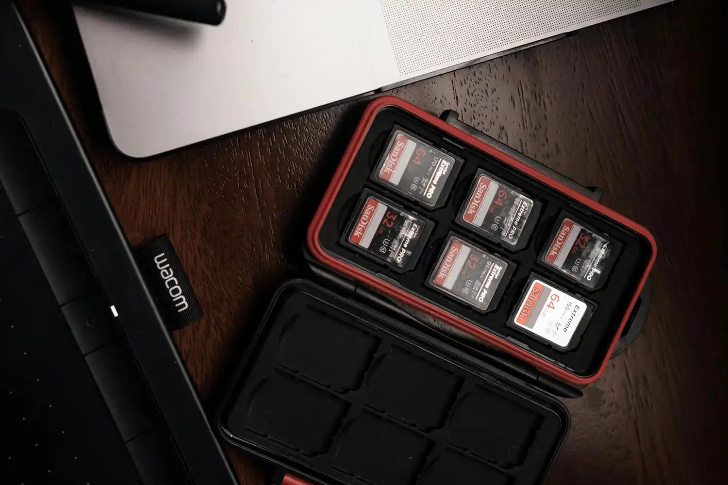
Popular memory cards for photography – what’s the best SD card for your digital camera? Choose the right capacity and class speed in our guide
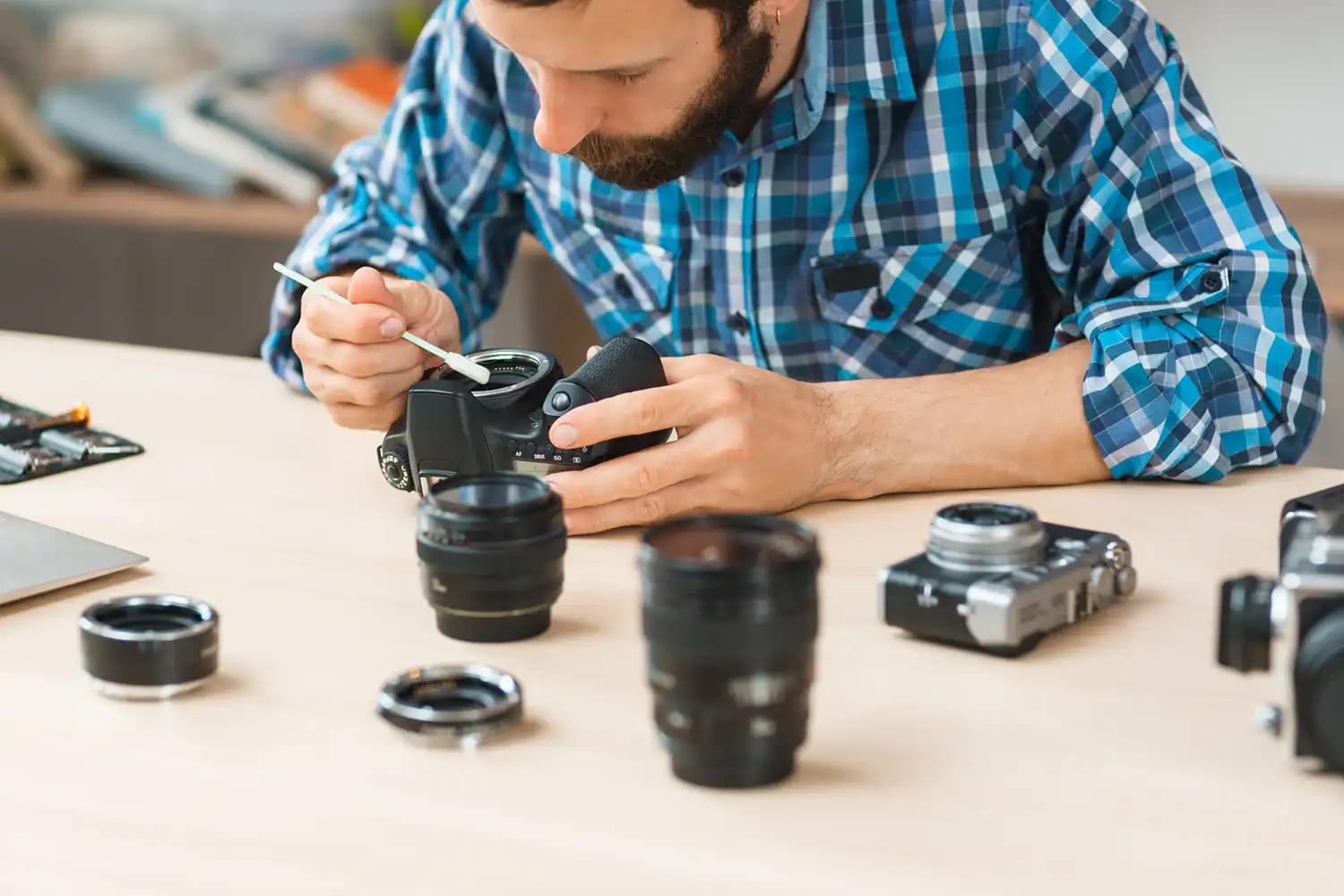
Discover the BEST way on how to clean a camera sensor using swaps, rocket blowers and pencil brushes to give your shots a dust-free finish!

Capture the magic of the night with our beginner’s guide to night photography. Learn tips and techniques for stunning results.
Learn the basics of photography – fast – with our FREE 60-Second Photographer online course. Each class is short and sharp with simple, actionable steps that give you immediate results.
x 30 lessons
© iPhotography™
Become a confident and competent photographer in less than 30 minutes!
Before you leave, make sure you’ve secured your FREE online photography course (worth £29.99)
Each class is just 60-seconds or less making it the fastest and easiest way to learn photography!